Hey everyone!
Welcome to my first blog post ever 😊
Today I’m going to dive into everyone’s favorite Excel feature – PivotTables!
If you’re a beginning Excel user, don’t be scared! I’ll show you how PivotTables are a lot simpler than you probably think.
What is a PivotTable?
Let’s start with a basic question – what is this mysterious “PivotTable” thing?
Microsoft’s definition:
A PivotTable is a powerful tool to calculate, summarize, and analyze data that lets you see comparisons, patterns, and trends in your data.
That’s a pretty solid definition, but if I had to make it more concise:
PivotTables let you organize your data into groups.
This is easiest to demonstrate with an example:
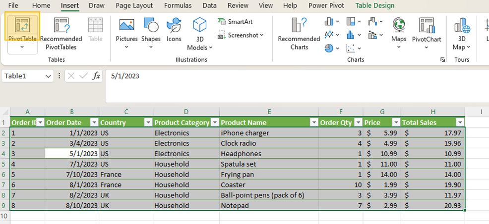
Say we have some very simple product sales data, like this:

Download the file here:
Just looking at the data, you can probably come up with a few different questions to investigate:
- How have Total Sales trended over the past few months?
- Which country has the most sales?
- What is the average Price by Product Category?
All of these can be answered in a straightforward way with PivotTables, by creating groups and then performing calculations (such as sum, average, etc.) across the groups.
Let’s dive in:
Step 1 – Inserting the PivotTable
Highlight your data (or Ctrl + A), go to the “Insert” tab on the ribbon and click “PivotTable”.
A dialog box will appear:
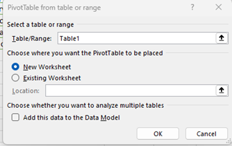
Since I’ve formatted my data as a table, I can simply select the Table by its name (Table1 in this case).
I’ll insert the PivotTable in a new sheet, but you can also put it in the same sheet if you’d like.
Click “OK”, and you should get something like this:
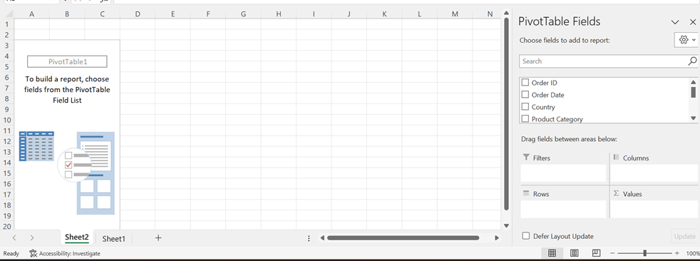
Step 2 – Using the PivotTable to Group & Aggregate
So now we need to decide two things:
- How we want to group the data (by Category, Country, Date?)
The groups will go in the “Rows” and/or “Columns” areas.
2. How we want to aggregate the data (sum, average, etc.)
The value we want to aggregate will go in “Values”.
Let’s start by breaking down the first question from earlier: How have Total Sales trended over the past few months?
So we know we’re going to be measuring Total Sales, so let’s drag that into the “Values” area:
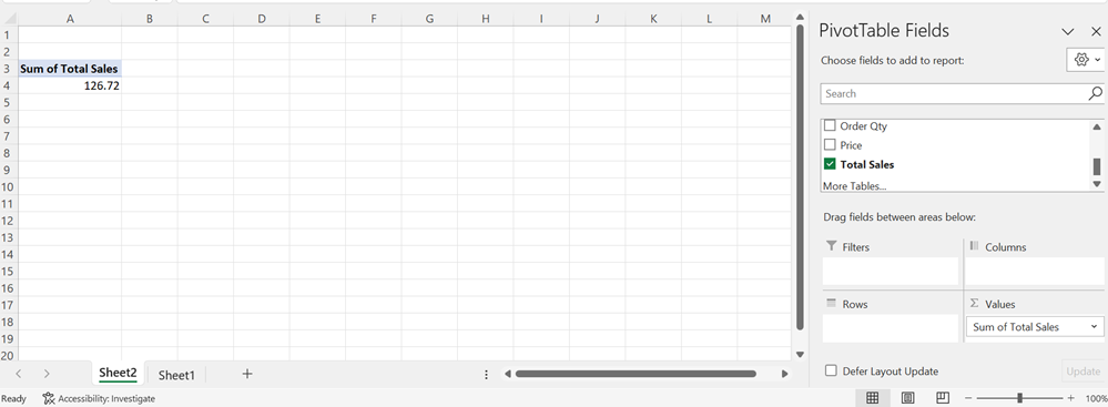
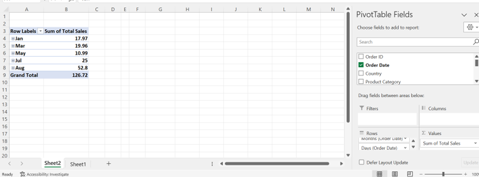
Nice! Notice that Excel defaulted to using “Sum” for the aggregation, which is perfect in this case because we want to know Total Sales.
So we’ve already created our aggregation, now we need to break the sum down into groups.
We want to know sales over the last few months, so this means we need to group the data by Order Date.
Let’s drag Order Date into “Rows”:
Awesome!
Notice how Excel automatically converted our date into a “date hierarchy” (Month, Day, etc.). If you expand the ‘+’, you can see the days underneath the month.
Ok, so we answered our question, but let’s make it easier to analyze by inserting a chart.
Step 3 – Inserting a PivotChart
Under “PivotTable Analyze” on the toolbar, click “PivotChart”:

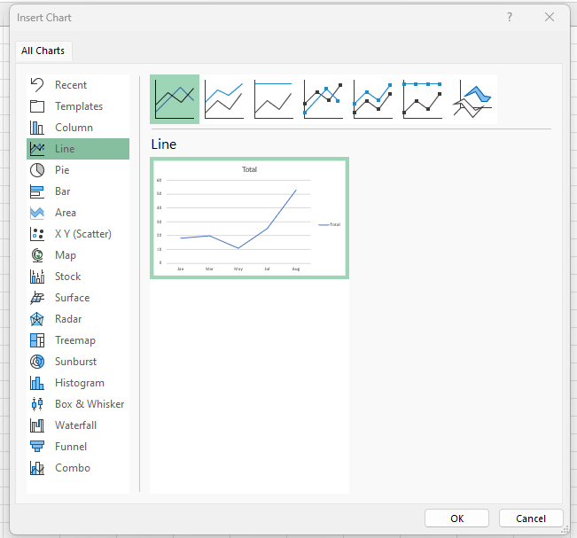
Since we want to see a trend over time, let’s choose a line chart.
Click “OK”:
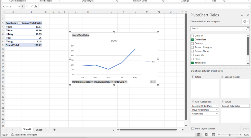
Pretty cool!
Now we can see how our Sales data is trending over time.
That’s it for today, ’til next time!